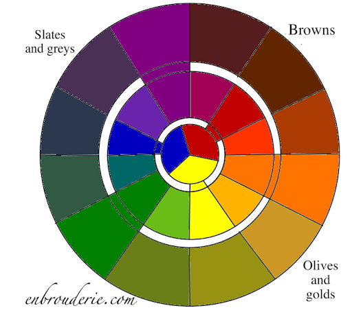
Y’all, I’ve been reading essays on color theory and thinking about color in embroidery design. And I noticed that there’s a missing piece in nearly all the online discussions I could find. Such a big hole, in fact, that I had to make my own color wheel because I couldn’t find one online (it’s pretty standard in art classes, though). I’m talking about the tertiary colors. Lots of folks know the standard secondary color wheel (the middle wheel below: red, orange, yellow, green, blue, purple), but tell me: where is BROWN?!?! Brown is a color. That wheel is clearly incomplete! I present to you the full color wheel: 
The inner wheel contains the primary colors (red, yellow, blue). The middle wheel includes the secondary colors, created by mixing two primary colors (for instance green = yellow + blue). The outer wheel includes the tertiary colors, created by mixing THREE primary colors. I will now quote my Expert Artist Consultant (hi mom!):
“Tertiary colors are those wonderfully subtle shades of mud. Browns, gray browns, yellow grays, gray greens, olive, blue gray, purple grays, maroon. All these colors are made by combining all three primary colors in varying degrees. For example, Red + (Lots of Yellow) + (a little bit of blue) = browns. Depending on how much and which yellow, red, and blue you use you will get anything from a deep maroon, to rusty brown, to gold, to tans.”
This applies to all colors:
- Blue + (Lots of Red) + (a little bit of yellow) = various shades of grey
- Yellow + (Lots of Blue) + (a little bit of red) = olive greens
- Etc.
Or you can mix two secondary colors:
- purple + green = (red + blue) + (blue + yellow) = greys and slates
If you take a look at the tertiary color wheel, you can see the different shades of greys you can get with varying proportions of purple and green.
So, don’t restrict yourself to the secondary color wheel! You may be distorting your color palette if you are using it as a basis for embroidery design. There are tons of tertiary colors missing – and out of sight, out of mind. I will be talking more about color and embroidery design in the future. I have a whole series of posts in mind!
Anyway, here are some blank color wheel diagrams you can download if you want to try it out yourself with embroidery, photoshop, paints, pastels, or whatever (format: pdf, png). Experiment away! Changing mixing proportions or using powder blue will create different versions of the color wheel. And feel free to use a copy of my own color wheel – just leave my blog address on there.
HAPPY BIRTHDAY TO ME, I’M TURNING TWENTY-EIGHT!!!!!

There’s a book for painters called “Yellow and Blue Don’t Make Green” or something similar, which is full of interesting stuff about colour mixing. If you ever want to do a Pointilist embroidery, all in French knots, reading up about colour mixing would be great preparation!
Oh man, pointilism sounds like an awful lot of work!
Happy Birthday,dear!! Very young at twenty eight…still a long way to go 🙂
🙂 thanks, Deepa.
What a wonderful age! Happy and colorfull birthday,Hannah! Be happy!
🙂 thanks!
Many more happy returns of the day.
🙂
i love colors, but…what about if one has some degree of color blindness but still want to be an artist?
A totally blind friend of mine does beading – she asks for a bit of help now and then with colors, but her necklace designs are amazing. They end up emphasizing shapes in a very unique way.
The interesting thing about textile art is that texture and shading can have just as much or more weight in a design as color. Plus, Johannes Itten described 7 types of color contrasts, some of which should apply regardless. Perhaps I’ll post on those next week.
you know, that’s a fascinating question. Thanks for asking it! Upon further consideration, it might be a real advantage in color-limited embroidery styles (whitework, blackwork, toda embroidery – Indian and only black + red, chikankari – Indian whitework, etc etc). The rest of us have to actively work to block out thinking about colors when trying to create good designs for those styles. You might naturally have more experience with those types of designs. In fact, some design courses insist that students start with monochromatic designs, since people get so distracted by color that the overall design stinks. What do you think?