Debate: Trunk Color

OK, folks, I’m looking for some opinionated people. The trunk (according to the kit) should be in 3 shades of gray. I’ve started work on it, but it’s not too late to change! I’ve had one commenter who prefers brown. Vines and trees are a theme in many designs. How do y’all pick your trunk colors in general? Do you go for brown? green? gray? gold? spice it up with purple? stripes? polka dots? And how do you decide? In this case, the upside to gray is that it won’t clash with any of the bright leaves or fruits, or fight with them for attention. And I wouldn’t have to pull it out.

Options: I could keep the gray, I could work another color in with the gray, or I could switch colors entirely. Opinions?

Posted in Crewel, My work | Tagged , , , , , | 25 Comments

1895 Wedding Handkerchief

All the news this morning seems to be obsessed with the British Royal wedding, so I’m going to continue the theme with photos of my great-great grandmother’s 1895 wedding handkerchief. Isn’t it incredible?

Posted in Grandma, Historical | Tagged , , | 22 Comments

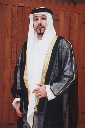
Saudi Arabian Bisht

This post is brought to you entirely thanks to a friend of mine. It would be completely impossible otherwise, since Google Translate is really terrible at Arabic. I don’t speak Arabic, or know much about Saudi Arabia, but my Expert Consultant does! I found these websites through Google Image Search for تطريز البشت (my friend’s suggestion), which means embroidered bisht, and my friend then translated for me.

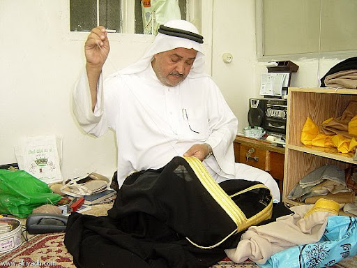
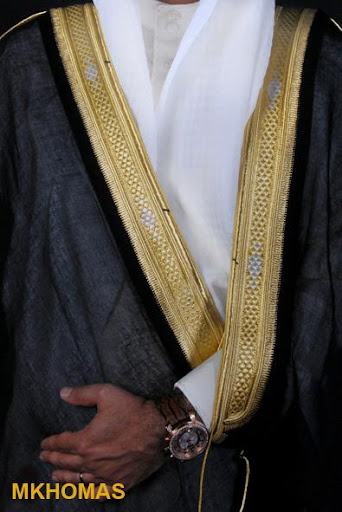
The bisht (بشت) is a traditional cloak worn by Saudi Arabian men on special occasions. Bisht is derived from the Persian word for “back” since it goes on your back. It’s generally made of wool, and is usually black, brown, beige, cream or grey. The focus is meant to be on the fancy embroidered edging. Since it’s men’s clothing, it’s traditionally created by men.

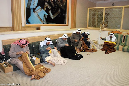
These two photos of the process of embroidering a bisht are from an article about someone who worked on research about the bisht. The researcher discovered that working in groups like the photo below resulted in higher quality embroidery.

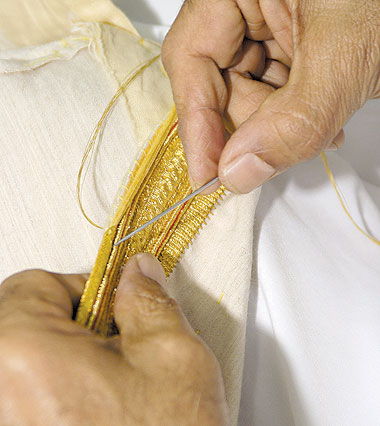
There are three main types of embroidery for a bisht: gold zari, silver zari, and silk. The gold and silver threads are called Zari, derived from a Persian word (source website). The silk type is less common.

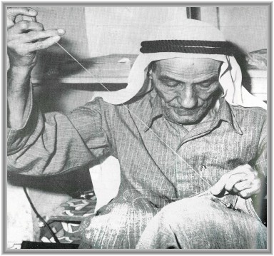
Embroidering a bisht by hand is a fading tradition. Most are created by machine embroidery now, but people are trying to preserve the art.

Posted in Embroidery around the world | Tagged , , , | 11 Comments

Little Mouse Finished

Well, folks, I finished the April mouse kit! Here it is, all framed up:

And here’s a closeup photo of the finished mouse:

Posted in My work | Tagged , , , | 6 Comments

Plas Teg Bellpull Kit!

OK, I gave in to temptation and started it (original post describing the kit). Two strands of floss with crewel stitching covers so much more ground than one strand of silk in satin, so I feel like I’m making progress. My other projects require a lot more creative thought, so they’re temporarily on hold until I have the energy for designing.

As I mentioned in the earlier post, I changed all the colors for the kit to slightly more intense shades. The exception is the Dark Ochre and Ochre colors – I really didn’t like the greeny brown DMC floss colors so I swapped them for an orange shade and a pale yellow shade (the edge of the leaf is “dark ochre” and the tendrils are “light ochre”). I’m debating whether the orange is too bright – I like bright but it might be drawing a little too much attention. I’ve got a slightly browner shade of floss I’m debating replacing it with (see photo). Y’all have any comments? The other thing that’s a little tricky for me is stem-stitching the tendrils over the chain stitch main stem.

Anyway, here is another photo of my progress:

Posted in Crewel, My work | Tagged , , , , | 11 Comments

Blackwork and Color Theory

Kathy at The Unbroken Thread recently completed an absolutely beautiful blackwork piece. The first photo is the finished piece. The second photo is missing some of the border, but it is at less of an angle so you can see the patterns clearly.

Many of the fillings are from String or Nothing, which generously provides 150 free blackwork filling patterns. So if this inspires you to start a blackwork project, all you need is an outline. You can read about the entire process to develop the hearts and flowers project to get you started.

I also wanted to talk some about value and shading in color theory! Kathy had a lovely post about shade and shadow, illustrated by a fuzzy picture of the project in progress.

See how the blackwork patterns create darker and lighter shading? This also applies to colored designs in other embroidery styles. Suppose you decide to fill a heart with a purple color (dark purple, light purple, blueish purple, reddish purple). You are not done designing! There’s texture to consider – smooth, fuzzy, loopy, bumpy, padded. Now are you done? No!!!! Satin stitch will be a very different color from a distance than trellis stitch – just like these blackwork fillings.

That said, don’t freeze up! Yes, there are lots of possibilities. No, you don’t have to consider all options every single time. Just pick something! If you already know what you want, that’s wonderful. But if you’re stuck and don’t like your current ideas, these questions can help you think of a new set to consider.

Posted in Blackwork, Color and design, Free resources online, Goldwork, patterns and designs | Tagged , , , , | 4 Comments

Color Contrast

One of the most important elements in design is contrast. Contrast makes design elements stand out, and draws the eye to important parts of your design. I’m just talking about color contrast today (there’s other kinds of contrast too! for instance, from textures).

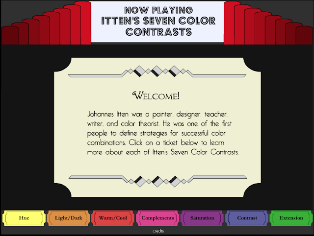
Johannes Itten was a famous artist and color theorist. One of his contributions was to describe the seven different ways that colors can contrast with each other. You can probably think of some of them immediately: light/dark,  or warm/cool are very common. But maybe you haven’t thought of all seven!

I found a fun flash website describing Itten’s seven types of color contrast. It’s set up as a theater: Click the ticket at the bottom to choose a contrast. It will display a title page with a definition of the type of contrast. A “PLAY” button will appear at the left. If you click it, the theater will show you an example of that type of contrast.

If you don’t like animation, here’s another website with some examples of the seven color contrasts.

Posted in Color and design | Tagged , , | 5 Comments

Progress on the Little Mouse

The little mouse from Woodland Threads is almost done! Only tiny details are left. The flower is missing stamens, the green seedpod is supposed to have some light green details, a short section of stem is missing, the mouse needs whiskers and a glint in the eye, and there are supposed to be some raindrops falling around the flower. Here is an extra picture of the mouse in progress:

Posted in My work | Tagged , , , | 4 Comments

Progress on the Chinese embroidery

I’ve been working on the Chinese silk embroidery kit (my post introducing it) from Elite Silk Arts. It’s really looking gorgeous! But you know, embroidering with a single silk strand takes a whole lot of stitches to cover an area. I think next time I may go for a smaller picture; 8×8 inches looks a lot quicker to finish! I sure am loving the results, though. The silk really shines in the sun. I haven’t quite figured out how to photograph that well yet.

Posted in My work | Tagged , , , , | 1 Comment

History of Colcha embroidery

Monique worked as the sound recording archivist of the John Donald Robb Archives of Southwestern Music at the Center for Southwest Research. She sent me more information on the history of colcha, and here is an edited version of her remarks:

The designs of Castelo Branco embroidery are so similar to New Mexico colcha. There was a period of time when Portugal was under the dominion of Spain, thus the accomplishments of the Portuguese were overlooked. King Philip II of Spain entered Portugal in 1580, and it was not till 1640 that Portugal regained its independence. However, during this time of expansion and flourishing trade, goods made their way to Mexico and on to New Mexico.

The Portuguese were the masters of the seas. When Afonso de Albuquerque, a Portuguese navigator and explorer sent to India in 1508, conquered the island of Goa in 1511, he opened a trade route to Europe (Albuquerque is also the name of the biggest city in New Mexico). Among the imports were magnificent bed covers, coverlets with the similar design as the one in Castelo Branco and also northern New Mexico. Coverlets (colcha) were viewed as exotic luxuries. According to the author Nicolau de Oliveira (1566-1634), “there were no ships from India that does not bring at least four hundred.”

Here is a traditional colcha embroidery design worked by Monique with Persian wool on linen (it’s 20 x 42 inches/41 x 101 cm):
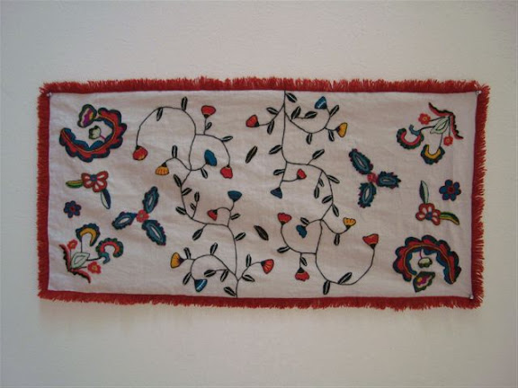
Can any of my Indian readers tell me which Indian embroidery styles may have inspired these?

Monique also sent me a list of books on colcha embroidery:

  • New Mexico Colcha Club: Spanish Colonial Embroidery & the Women Who Saved It, by Nancy Benson
  • Stitching Rites: Colcha Embroidery along the Northern Rio Grande, by Suzanne P. MacAulay (This book is about colcha stitchers in the San Luis valley of Colorado, especially colchera Josie Lobato.)
  • Weaving and Colcha from the Hispanic Southwest: Authentic designs, by William Wroth (This includes many designs.)
  • Colcha Embroidery Handbook, by Karen Schueler (This is about techniques.)
  • Colcha, by E. Vigil (Available from the Espanola Valley Fiber Arts Center. The author’s mother is featured in Nacy Benson’s book.)
  • The EVFAC also has supplies for colcha, such as churro yarn (http://www.evfac.org/for-sale/equipment.html.)

A lot of the books are available at a library nearby, so I’ll be checking them out myself sometime soon. I’ll keep y’all updated!

Posted in Castelo Branco, Colcha embroidery | Tagged , , , | 9 Comments