Monique’s Colcha Embroideries

I had a colcha expert write in! Hurray!!!! Today I’ll show two examples of Monique’s work. Next week I’ll follow up with information she gave me on the history of colcha embroidery. You can check the colcha embroidery section of my blog for past posts on the subject.

One very interesting thing about the colcha community in New Mexico is that many of them are involved in the process of weaving their fabrics and spinning or dying their wools. Monique buys raw fleece in Taso, NM then washes, combs, spins it onto a spindle, and dyes it with natural dye extract or plants from the yard.

The traditional wool is locally called Navajo churro, from the local breed of sheep. The original name from Spain was churra, but changed over the years. The breed nearly went extinct, but the Diné/Navajo saved it and thus it is now called Navajo churro. It’s still a rare breed.

This colcha depicts a family at a Mexican market. The design was inspired by works of Carlos Mérida, a Guatemalan artist who spent time in Mexico. The background cloth is nubby linen. The baby is in Merino wool from Renaissance natural dye. The orange top for the girl on the left, her skirt, the skirt and sleeve of the girl next to her, and the grandmother’s top and sleeve are embroidered with 2 ply churra (it also comes in 3 ply). The blue skirt and top are dyed with Woad. I think the rest might be in single sabanilla wool.

The colcha rose is a prize-winning work from the Taos Wool Festival. The background is knitted churra, and the rose is embroidered with 2 ply churra. The reddish embroidery wool was dyed with Madder chips by a friend of hers and the rest of the wool by Monique using weld and four kinds of mint.

Posted in Colcha embroidery, Embroidery around the world | Tagged , , , , | 9 Comments

Examples of Kantha embroidery

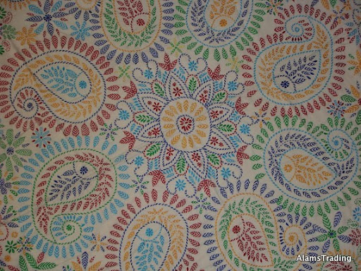
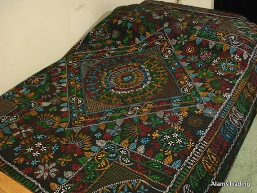
I’ve been growing more and more interested in South Asian embroidery. It’s wonderful stuff! In fact, I’ve found some great books in the library, so you’ll be seeing the results from that expedition at some point. In my last post on kantha embroidery (which is done entirely in running stitches) I linked to a lot of tutorials but not many pictures of the results. I’ve continued looking for information, and found these absolutely fantastic photos in an etsy shop for modern kantha embroidery (it’s based in New Jersey).

I have got to start incorporating this into my own work. Here are a few close-ups of the running stitches, so that you believe it’s really done entirely in running stitches:

Posted in Indian embroidery | Tagged , , | 7 Comments

Design decisions for the Turkishesque embroidery

I thought I’d talk about my design process for the Turkish-esque embroidery. I transferred the design using carbon paper. While the design transferred onto the fabric beautifully, it transferred off the fabric just as quickly. This accelerated the decision process considerably, though I didn’t make it through before losing the outlines for a couple flowers.

Supply list (considerably less than $10)

  • cloth napkin from a thrift shop
  • carbon paper
  • leaves, stems: DMC 3808, 3809, 3810, 3811
  • flowers: DMC 3830, 3778, 3802, 355
  • flowers: DMC Color Variations 4128

Future work: All the large leaves are supposed to have fillings (like the two near the bottom). I’m not sure I like the effect of my current fillings, so I may rethink my approach. I plan to fill in the flowers more, particularly the one on the right, and there’s a missing flower to redraw.

Design principles for this project:

  • Keep lights and darks balanced for the blue-green stems and leaves.
  • Don’t be too predictable, but repeat some elements throughout the piece so it feels like the different parts of the design belong together (continuity vs variety).
  • Emphasize the focus of the design – the flowers (color contrast).

Color decisions: I looked through my stash of embroidery floss, and discovered I had a range of 4 blue-green colors (DMC 3808, 3809, 3810, 3811). I thought these might make a more interesting design with the stems and leaves than a standard green leaves and brown stem. I posted a lot about tertiary colors last week, so I picked some out of my stash (DMC 3830, 3778) for the flower on the right. These contrast well with the blue-greens. I decided on a purpleish color (DMC 3802) and a complementary golden yellow/tan (DMC Color Variations 4128) for contrast to emphasize the big dragon flower. The golden yellow/tan can look brown or golden, depending on which colors surround it. I picked DMC 355 (reddish-brown) for the topmost flower. It only looks red next to the green – otherwise it looks rather brown.

Stitch decisions:

I chose Portuguese border stitch for the stems, in the darkest blue-green. I worked outlines for large leaves in back stitch, stem stitch, and split stitch and worked the small leaves in herringbone stitch. The purple-and-yellow flower center was inspired by kantha embroidery. The yellow flames are in fly stitch.

Posted in My work | Tagged | 9 Comments

Xiang Silk Embroidery

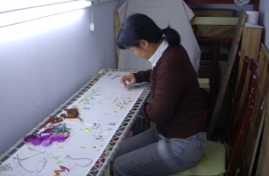
OK, I swear the number of embroidery projects I’m working on simultaneously is not exponentially increasing. Really. This blog is definitely not helping though – I keep finding more things to try out. Regardless, I wanted to mention a wonderful kit I started a few weeks ago before I got distracted by the mouse and the Turkish embroidery designs. This kit is from Elite Silk Arts, a company run by Mindy out of Los Angeles California and Hunan, China, which sells both finished work and embroidery kits. The photo is of her studying under Master Yuqin Han on a visit to China in 2010. Here’s my kit (I love the colors):

My progress so far: most of one big purple flower and several small yellow and white flowers. I think I’ll be pretty good at silk shading and long-and-short stitch by the time I’m done. Got any advice? Mindy suggested longer stitches on the purple flowers. I still have plenty of flowers left to improve my stitching on.

The section for embroidery kits includes sizes from 6×6 up to much larger kits. These kits are not step-by-step directions – the design is printed on the fabric, all the silk is included, and there are some general instructions on embroidering flowers and birds (4 pages), but it is definitely a creative endeavor. On the other hand, it’s silk, so anything you do looks fantastic! The designs are lovely, and they’re super affordable ($18 for the 8×8 including shipping). There are some additional technique instructions on the website and some simple free patterns.

The website is full of information. There’s a section about the major styles of Chinese embroidery, a gallery of Chinese folk embroidery, an essay on the history of embroidery in China, and a list of Chinese embroidery masters with short summaries of their major works.

Posted in Design sites, My work | Tagged , , , , | 6 Comments

Hair embroidery

Today I thought I’d write about a New Zealand artist, Liyen Chong, who embroiders with hair. Her work is amazing; you should check out the rest of it at her website. The hair produces some interesting textures. (I initially saw a link to her at Jenny Hart’s blog, Embroidery as Art.)

The Golden Firebird (who traveled from China and settled here), 2006

The Dreamer, 2009

I know not who I am but I know who I might be, 2007

Posted in Surface embroidery | Tagged , , , , | 4 Comments

Turkish-esque embroidery

Ever since I ran across this etsy shop by chance, I’ve been dying to learn more about Turkish embroidery. The work there is really beautiful (shockingly expensive, too). So I’ve been desperately ransacking the internet looking for information. I still haven’t found a good source of information on traditional stitches or colors (if you know of one, tell me!!!! I want to know!!!), but I kept running into mentions of ISMEK and tried investigating their website. ISMEK is an art and vocational center in Istanbul which provides classes on a lot of crafts, including embroidery. It also has a free downloads section that includes four incredibly stunning pattern books!

I was so excited about these gorgeous designs that I started on one this weekend (see the picture!). It’s not quite done yet, but will be soon. Isn’t it lovely? This one is from Desen Kitabi 4 (Pattern Book 4). You can find the other three lower on that page (Desen Kitabi 1, 2, and 3). If anyone reads Turkish, I really really want to know what the introduction says. I’m calling my work Turkish-esque embroidery since the colors and stitches are all my choice though the design is Turkish.

I tried to email ISMEK to thank them (somebody over there might speak English! and I included a Google Translate version in Turkish!) and see if they wanted to say anything more but all the emails bounced 😦 I put a message in their contact form, but no response. Oh well. I found their page for hand embroidery, but it had almost no additional information. Anybody have more information?!?! Anyway, ISMEK, I love you!!!!!

Posted in Embroidery around the world, Free resources online, My work, patterns and designs | Tagged , , , , | 24 Comments

Embroidered color wheel

Good morning, y’all! Today I have another post about color to round out the week. I have a special guest poster, my Expert Artist Consultant, who embroidered the color wheel below and wrote most of the post.

The color wheel in action (split stitch, cotton floss):

The three primary colors are in the center: yellow, red, blue. The secondary colors form the next circle. These colors are mixtures of two primary colors. Orange comes from mixing red and yellow. Add more yellow for yellow orange, more red yields red orange. The same holds for the other colors. I chose a range of oranges, greens, and purples to illustrate.

Complementary colors: Two colors which are opposite on the color wheel. One is a primary color, the other (its complement), is made of a mixture of the other two primary colors. Yellow and purple are complements. Ditto red and green, blue and orange. Very strong action here. When two complementary colors are juxtaposed they will practically jump off the page. To see this in action look at the color wheel. In the third circle next to each secondary color is the complementary color.

Almost complementary colors: Two colors which are almost opposite on the color wheel. Very strong action but subtle. Yellow and purple-gray (purple-gray = blue+red+yellow). Blue and browns. Red and olive greens. (Hannah: For example, this Hmong cross-stitch with a color scheme based on almost-complements teal and brown)

The final circle shows just a sample of tertiary colors juxtaposed to their almost complement. You can compare the difference between the action of the true complements on one side with the almost complements on the outside. Interesting, huh?

OK, I (Hannah) am going to jump in with more examples now. You can also take these almost-complementary colors into account when deciding on framing and mat colors for finishing your embroidery, in order to make your work really pop out.

Some examples of using tertiary colors for contrast in paintings by Titian (Tiziano Vecelli), an important 16th century Venetian painter:

Some examples from Vincent van Gogh:


Some embroidery examples with tertiary colors from Talliaferro Designs:

Neat embroidered secondary color wheels by other people:

Posted in Color and design, Mother | Tagged , , , | 2 Comments

Color Quiz!

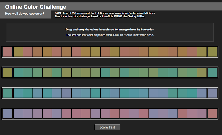
I have a fun color quiz for everyone today. It tests how well you recognize different hues – it gives you a line-up and you have to organize the colors in order from one end to the other. It’s surprisingly tricky to get them all right! Here is a screenshot of the FM 100 Hue Test:

I got a 12, which is pretty good! 0 is the perfect score, and 100 is the worst. It also gives you a graph of the colors with bars that show where you made mistakes:

For comparison, here are my brothers’ results:

And here are my parents’ results:

Update: I remembered where I found this quiz, it’s at Rayela’s Fiber focus blog.

Update to Update: The top score is higher than 100. Oops.

Posted in Color and design | Tagged , , | 5 Comments

Brown Is A Color

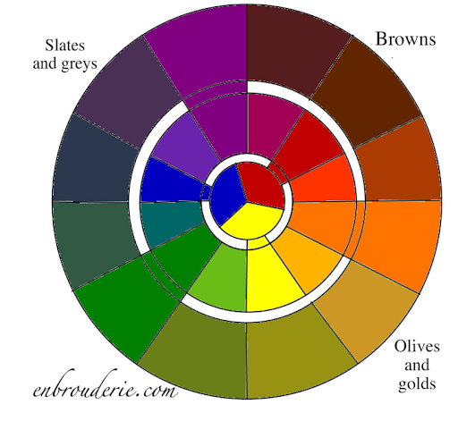
Y’all, I’ve been reading essays on color theory and thinking about color in embroidery design. And I noticed that there’s a missing piece in nearly all the online discussions I could find. Such a big hole, in fact, that I had to make my own color wheel because I couldn’t find one online (it’s pretty standard in art classes, though). I’m talking about the tertiary colors. Lots of folks know the standard secondary color wheel (the middle wheel below: red, orange, yellow, green, blue, purple), but tell me: where is BROWN?!?! Brown is a color. That wheel is clearly incomplete! I present to you the full color wheel:

The inner wheel contains the primary colors (red, yellow, blue). The middle wheel includes the secondary colors, created by mixing two primary colors (for instance green = yellow + blue). The outer wheel includes the tertiary colors, created by mixing THREE primary colors. I will now quote my Expert Artist Consultant (hi mom!):

“Tertiary colors are those wonderfully subtle shades of mud.  Browns, gray browns, yellow grays, gray greens, olive, blue gray, purple grays, maroon. All these colors are made by combining all three primary colors in varying degrees. For example, Red + (Lots of Yellow) + (a little bit of blue)  = browns. Depending on how much and which yellow, red, and blue you use you will get anything from a deep maroon, to rusty brown, to gold, to tans.”

This applies to all colors:

  • Blue + (Lots of Red) + (a little bit of yellow)  = various shades of grey
  • Yellow + (Lots of Blue) + (a little bit of red)  = olive greens
  • Etc.

Or you can mix two secondary colors:

  • purple + green = (red + blue) + (blue + yellow) = greys and slates

If you take a look at the tertiary color wheel, you can see the different shades of greys you can get with varying proportions of purple and green.

So, don’t restrict yourself to the secondary color wheel! You may be distorting your color palette if you are using it as a basis for embroidery design. There are tons of tertiary colors missing – and out of sight, out of mind. I will be talking more about color and embroidery design in the future. I have a whole series of posts in mind!

Anyway, here are some blank color wheel diagrams you can download if you want to try it out yourself with embroidery, photoshop, paints, pastels, or whatever (format: pdf, png). Experiment away! Changing mixing proportions or using powder blue will create different versions of the color wheel. And feel free to use a copy of my own color wheel – just leave my blog address on there.

HAPPY BIRTHDAY TO ME, I’M TURNING TWENTY-EIGHT!!!!!

Posted in Color and design, Mother | Tagged , , , | 12 Comments

Godzilla versus Mouse

Godzilla: This is my entry for the Crochet Wall Hangings division in a state fair some years ago. I got a blue ribbon for it! I designed it myself – with a few tips from my Expert Artist Consultant (hi mom!) when I was having difficulty making the legs look natural. It’s done entirely in single crochet, but in retrospect I think cross-stitch would have been a lot easier. The many color changes required for crochet were a little irritating.

Next, here’s an update on my progress on the mouse kit from Woodland Threads (previous post on the mouse).

Posted in Cross-stitch, My work, Surface embroidery | Tagged , , , , | 2 Comments